Button Placement Patterns: How Visual Layout Choices Drive Completion Rates in Promotional Registration Flows
Written by Klara Zimmermann · Oct 12, 2026
Button Placement Patterns: How Visual Layout Choices Drive Completion Rates in Promotional Registration Flows
Registration flows for promotional offers rely on precise visual arrangements where button placement influences how users progress through each step and data from multiple studies tracks these effects across desktop and mobile interfaces. Researchers at institutions focused on human-computer interaction have documented that primary action buttons positioned in alignment with natural eye movement paths correlate with higher completion percentages while scattered or low-contrast placements show measurable drops in progression rates.
Established Layout Patterns and Their Measured Impacts
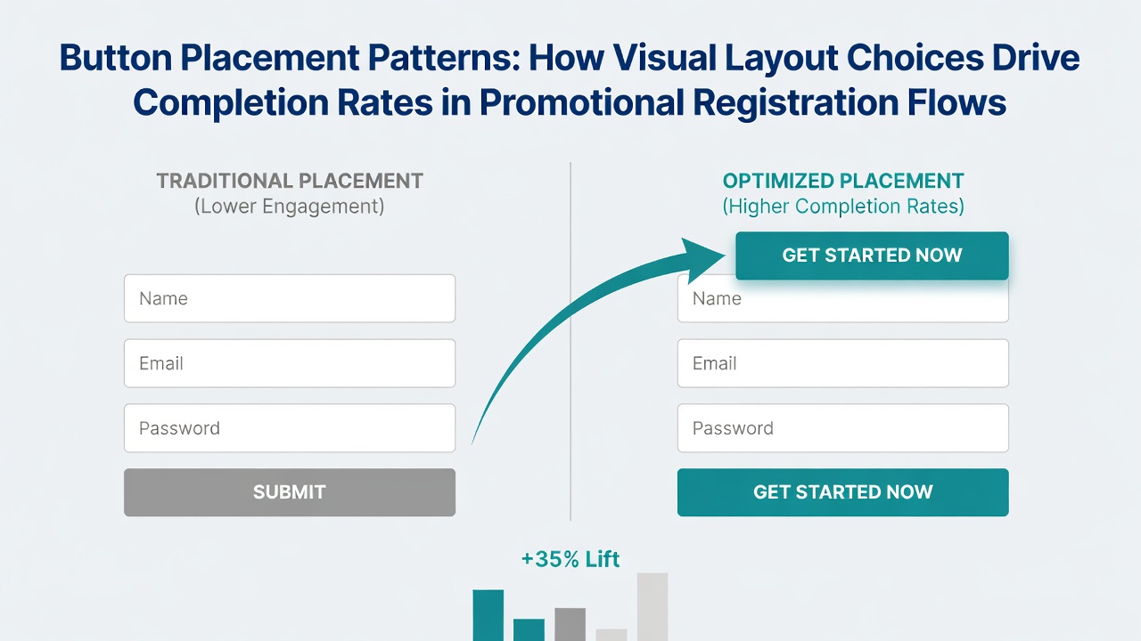
Eye-tracking experiments reveal that forms following a Z-pattern layout place the main submission button at the end of a diagonal scan line which users typically follow from top left to center then down to bottom right and this configuration appears in many promotional interfaces designed for quick entries. In contrast F-pattern arrangements concentrate attention along the left margin and top horizontal band so buttons located in those zones receive earlier visual focus according to recordings from participants completing registration tasks. Data collected across several thousand sessions indicates that buttons aligned with these established scanning behaviors produce completion rates several points higher than those placed outside the primary visual tracks.
One analysis of registration interfaces conducted over a twelve-month period found that moving the final action button from a lower right corner to a position directly below the last input field increased successful submissions by noticeable margins while similar adjustments in the opposite direction produced corresponding declines. Observers note that these shifts occur because users encounter the button at the moment their attention is still engaged with the preceding fields rather than after scrolling or searching.
Mobile Interface Adjustments and Completion Data
Smaller screens introduce additional variables because thumb reach zones and viewport limitations alter where buttons perform best and studies tracking mobile registration flows show that buttons placed within the lower third of the visible area often record stronger tap rates than those requiring users to scroll further. Research released in October 2026 from a collaborative project involving North American and European design labs confirmed that interfaces optimized for one-handed operation with the primary button near the natural resting position of the thumb achieved higher progression percentages across tested promotional campaigns compared with centered or upper placements that forced grip adjustments.
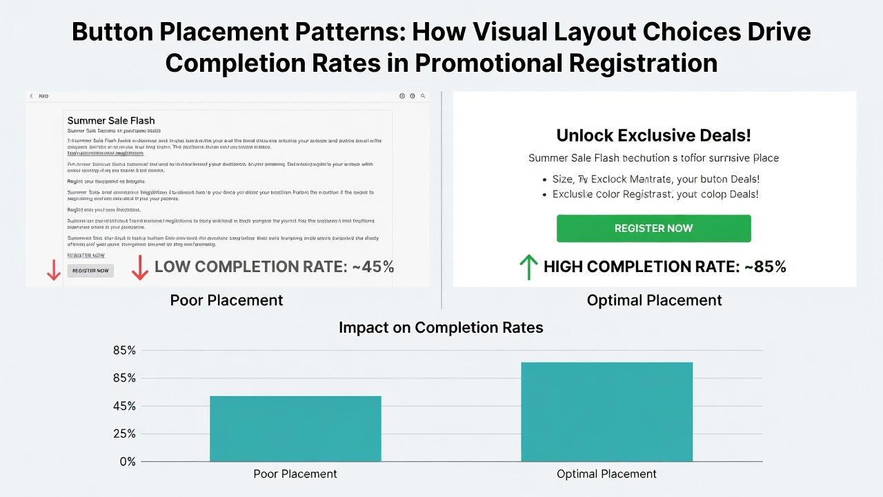
Yet the same dataset highlighted that excessive clustering of multiple action buttons in the thumb-friendly area sometimes created selection errors so spacing guidelines emerged as an important accompanying factor. Those who've examined large-scale A/B test results across promotional platforms observe that single prominent buttons located after form fields outperform both stacked options and floating action elements in most tested scenarios.
Supporting Evidence from Industry and Academic Sources
Figures from academic papers on form interaction demonstrate that visual hierarchy created through button size and proximity to input fields guides completion behavior more reliably than color alone and reports from design research centers have quantified these relationships in controlled environments. Nielsen Norman Group analyses of registration sequences provide extensive documentation on how placement relative to content blocks affects user paths while maintaining consistency with accessibility standards. Additional data shared by the Australian Digital Transformation Agency through public digital service evaluations shows comparable patterns in government and commercial promotional contexts where button positioning aligned with reading order produced measurable improvements in task completion.
Take one set of tests performed on promotional landing pages where researchers varied button locations systematically and recorded that shifting the primary control from below a lengthy privacy notice to a spot immediately following the email field reduced abandonment at that stage. Another example comes from interfaces that incorporated progress indicators alongside the button and completion rates rose when the visual element and button appeared in close vertical proximity rather than separated by large gaps.
Cross-Device Patterns Observed in Recent Analyses
Comparative studies between desktop and mobile versions of the same promotional registration flows indicate that desktop users tolerate greater variation in button position because larger viewports allow more flexible scanning whereas mobile users respond more consistently to placements that minimize scrolling distance. Data indicates that responsive designs which reposition the button dynamically based on screen size maintain steadier completion percentages across device types than fixed layouts that ignore these differences.
Conclusion
Patterns in button placement within promotional registration flows rest on documented relationships between visual attention and interaction outcomes with evidence drawn from eye-tracking records, large-scale A/B tests, and multi-device evaluations. Researchers continue to refine these observations as interface technologies evolve yet the core finding remains that alignment with established user scanning behaviors and device-specific reach considerations supports higher rates of form progression. Ongoing monitoring of placement effects across different promotional contexts supplies the factual basis for design decisions that prioritize measurable completion metrics.